Creating Unique Icons: Design Principles and Practical Applications
Understanding Icons: Their Importance and Types
Icons serve as the visual language in design, providing an immediate understanding of an application’s functionalities or information. The Icons we encounter daily are more than mere images; they encapsulate meaning, enhance user experience, and influence the aesthetic feel of a project. Understanding their role is vital for designers aiming to create engaging and effective interfaces.
1.1 The Role of Icons in Design
Icons are integral to visual communication in design. They simplify complex concepts into easily recognizable images. Research indicates that humans process visuals 60,000 times faster than text, underscoring the necessity of incorporating icons in user interfaces. For instance, a simple envelope icon universally conveys the action of sending an email.
In digital applications, icons guide user navigation and decision-making. They can improve accessibility by providing a visual representation of options, which assists users who might struggle with text-heavy interfaces. As a result, effective icon usage can lead to improved user satisfaction and increased engagement metrics for websites and apps.
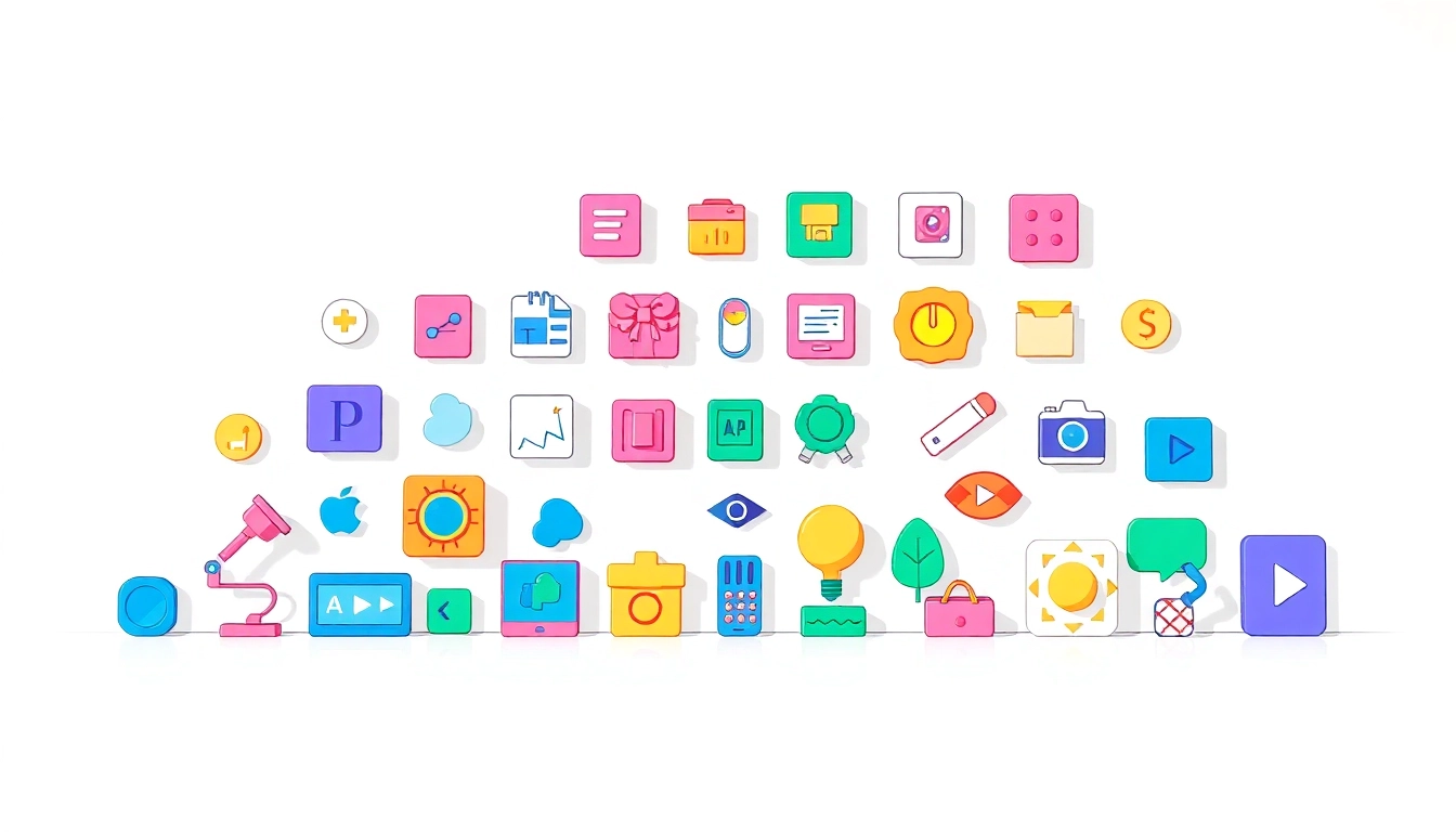
1.2 Different Types of Icons and Their Uses
Icons can be categorized into several types, each serving distinct purposes:
- Action Icons: These represent actions, like ‘upload’, ‘download’, or ‘delete’.
- Social Media Icons: Standardized representations of various platforms (e.g., Facebook, Twitter).
- Navigation Icons: Used to guide users through an interface, e.g., arrows, home, back buttons.
- Status Icons: Indicate various states like loading, success, or error.
- Brand Icons: Visual elements representing a brand’s identity, often used for logos.
Each type serves a unique function, transforming how users interact with technology and information. Choosing the right icon for the right context is crucial for effective communication and user experience.
1.3 Choosing Icons for Your Project Needs
Selection is key when it comes to designing meaningful icons. Here are fundamental considerations:
- Audience: Understand your audience’s preferences and cultural context to ensure that your icons resonate with them.
- Clarity: Choose icons that are easily understood to avoid confusion. Simple shapes and familiar imagery often work best.
- Consistency: Maintain a cohesive style throughout the project to create a unified brand experience.
- Size & Scalability: Icons should be designed to maintain clarity and recognizability across different sizes.
Key Design Principles for Icons
Effective icon design goes beyond mere aesthetics, relying on principles that enhance usability and communication.
2.1 Simplicity and Clarity in Icon Creation
One of the primary tenets of icon design is simplicity. A cluttered or overly complex icon can confuse users rather than inform them. Successful icons are often minimalistic, focusing on the essential elements that convey meaning without superfluous detail. For instance, the universal ‘trash can’ icon for deletion relies on a straightforward design that users quickly attribute to its function.
2.2 Consistency: Developing a Cohesive Icon Set
Consistency in style, color, and scale is vital in creating a successful icon set. When users encounter multiple icons in an interface, they should visually coalesce into a unified theme. This coherence not only enhances the overall aesthetic but also reinforces brand identity, making the user experience seamless and intuitive.
2.3 Color Theory and Symbolism in Icons
Color plays a significant role in icon design, evoking emotions and meaning. For example, red often signifies alertness or danger, while green typically conveys permission or safety. Therefore, careful consideration of color not only enriches an icon’s aesthetic appeal but also enhances its communicative power. Designers must employ color theory strategically to ensure icons are effective across various contexts and cultures.
Creating Icons: Tools and Techniques
Creating memorable and effective icons requires the right combination of tools, techniques, and inspiration.
3.1 Graphic Design Software for Icon Creation
Today’s graphic designers have a plethora of software options available for icon creation:
- Adobe Illustrator: A professional-grade tool for creating vector graphics, ideal for scalable icons.
- Sketch: Popular among UI/UX designers for its vector-based capabilities and ease of use.
- Figma: A collaborative design tool that enables teams to work on icon designs in real-time.
- Inkscape: A free, open-source option providing robust features for icon creation.
Choosing the right software depends on specific project requirements, personal preference, and collaboration needs.
3.2 Tips for Vectorizing Icons for Scalability
Vectorization is essential for creating icons that remain clear at any size. Here are practical tips:
- Use Shapes: Build icons using basic shapes like rectangles, circles, and lines.
- Outline Paths: Convert filled shapes to outlines for more precise control over design elements.
- Combine Shapes: Use tools like ‘Unite’ or ‘Subtract’ to merge or cut shapes effectively.
- Maintain Proportions: Keep proportions consistent to ensure visual harmony.
By adhering to these tips, designers can create icons that retain their integrity irrespective of size adjustments.
3.3 Utilizing Online Resources for Icon Inspiration
The vast array of styles and designs available online can serve as significant sources of inspiration for designers. Some recommended platforms include:
- Dribbble: A showcase platform where designers share their work, offering visual inspiration.
- Behance: A platform for creative professionals to display and discover design projects.
- Pinterest: A social media site that allows for visual discovery, with myriad boards dedicated to icon design.
- Designspiration: A tool for discovering various designs that can serve as a springboard for creativity.
Icon Trends: What’s Popular in Today’s Design Landscape
Iconography is a dynamic field that evolves constantly, influenced by design trends, technology advances, and user behavior. Keeping abreast of the latest trends can help designers create modern and relevant icon sets.
4.1 Analyzing Current Trends in Iconography
Trends in icon design shift over time, often driven by a desire for simplicity and functionality. Recent trends include:
- Flat Design: Emphasizes minimalist structures without shadows, focusing on simplicity.
- Micro-interactions: Icons that animate subtly upon interaction, enhancing user feedback and engagement.
- Dynamic Icons: Icons that adapt based on user choices or contextual information.
4.2 The Emergence of 3D and Animated Icons
With advancements in technology, 3D icons and animations are gaining traction. These offerings provide more engaging visual experiences, allowing for storytelling through design. For example, animated icons can illustrate actions more vividly, such as a loading icon that spins or pulsates to indicate progress. The key is ensuring that animations enhance rather than distract from the core functionality.
4.3 How Minimalism Is Reshaping Icon Design
Minimalism continues to dominate design philosophy, focusing on the idea that ‘less is more’. This trend emphasizes clean lines, ample white space, and the stripping away of all non-essential elements. As a result, icons are becoming simpler and more abstract, allowing them to convey messages swiftly and effectively. Designers are presenting ideas using minimal strokes, which emphasize creativity within constraint.
Implementing Icons: Best Practices for User Experience
Integrating icons into user interface design demands careful consideration and a thorough understanding of user experiences.
5.1 Integrating Icons in Web and Mobile Design
When implementing icons in web and mobile applications, consider the following best practices:
- Placement: Icons should be placed near corresponding text labels or actions to provide clear context.
- Size: Ensure that icons are legible across different devices, maintaining usability on smaller screens.
- Feedback: Use icons that change state upon user interaction (e.g., button hover effects) to indicate activity.
5.2 Accessibility Considerations for Icon Use
Accessibility remains a primary concern for designers. Effective icon usage must consider users with disabilities. Implementing these practices can greatly enhance accessibility:
- Alt Text: Provide alternative text for icons, aiding screen reader users in understanding their purpose.
- Contrast: Ensure there is sufficient contrast between icon colors and backgrounds for visibility.
- Size Adjustment: Icons should be large enough to be clickable, particularly on touch devices, to facilitate ease of interaction.
5.3 Measuring the Impact of Icons on User Engagement
Understanding the effectiveness of icon usage hinges on tracking engagement metrics. Here are essential approaches for evaluation:
- A/B Testing: Test different icon designs to see which versions yield higher conversion rates.
- Heatmaps: Analyze heatmap data to see where users are clicking and how frequently they engage with specific icons.
- User Feedback: Collect qualitative feedback from users on icon clarity and effectiveness through surveys or interviews.


Post Comment